
A homeowner finds your kitchen remodeling company on her phone. She likes the photos, sees that you serve her neighborhood, and decides to book a showroom visit. Then your site sends her to a form that asks for a project budget and a start date before she can see a single available appointment. She just wanted to know if Saturday was open.
You earned her interest. Your website gave her a reason to put the decision off.
That’s why improving your website’s user interface (UI) and user experience (UX) can matter as much as getting more people to visit in the first place. Start with the people who are already interested. Can they find what they need, trust what they see, and take the next step?
UI makes the next step clear. UX makes it work.
UI is what customers see and interact with: the menu, the text on a button, the layout, and the fields they fill in. UX is how the task goes: how fast the page loads, how easy it is to find an answer, and whether booking ends with a confirmation or a question mark.
Think about the showroom again. A prominent Book a showroom visit button is a good interface decision. Showing available times before asking for contact details is an experience decision. Sending a confirmation with the address, parking instructions, and a way to reschedule makes the visit easier to follow through on.
If you only changed the button color, you might get more people to start the form. The goal is to help them finish.
What the research says about losing customers along the way
In Baymard Institute’s checkout research, 17% of U.S. online shoppers surveyed said they had abandoned an order in the previous three months because checkout was too long or complicated. That’s a self-reported reason for leaving an online checkout. For a service business, it suggests a useful question to test: are you asking people to do more than the next step requires?
Speed can matter even when the design stays the same. In a Vodafone landing page A/B test published by web.dev, the faster version recorded 8% more sales. The two versions looked and behaved the same; the optimized version improved Largest Contentful Paint, a measure of how quickly the main visible content appears, by 31%. That was one campaign. The business case for testing your own pages is that design, copy, and load speed can each affect how easy it is for a ready customer to act.
Fix the page closest to a sale
Pick the page that sends people to a purchase, quote, or booking. Open it on your phone and try to complete the task from beginning to end. Look for these four problems first:
- The offer is hard to understand. Put the answer customers came for near the top: what you do, who it’s for, and what happens next. If they reached you from an ad for a showroom visit, the page should talk about the visit before it gives them your company history.
- The form asks for too much too early. Ask what you need to complete this step. If budget is essential to qualify an estimate, explain why you’re asking. If the customer is simply reserving a showroom visit, save the detailed project questions for later.
- Something gets in the way on mobile. Check whether a popup covers the booking button, a large image delays the offer, or the calendar is hard to use on a smaller screen. Keep form labels visible and clearly associated with their fields, and make error messages tell people how to fix the problem. The W3C’s guide to accessible forms shows how to do this. Try the form with a keyboard as well as on a phone.
- The site leaves people guessing. Put useful proof where a decision happens: an example of relevant work, pricing guidance if you can provide it, or a short explanation of what the customer is committing to. After they act, confirm what happened and when they’ll hear from you.
Some steps are there for a good reason. A service-area check can save a customer from booking an appointment you can’t honor. The aim is to make each step earn its place.
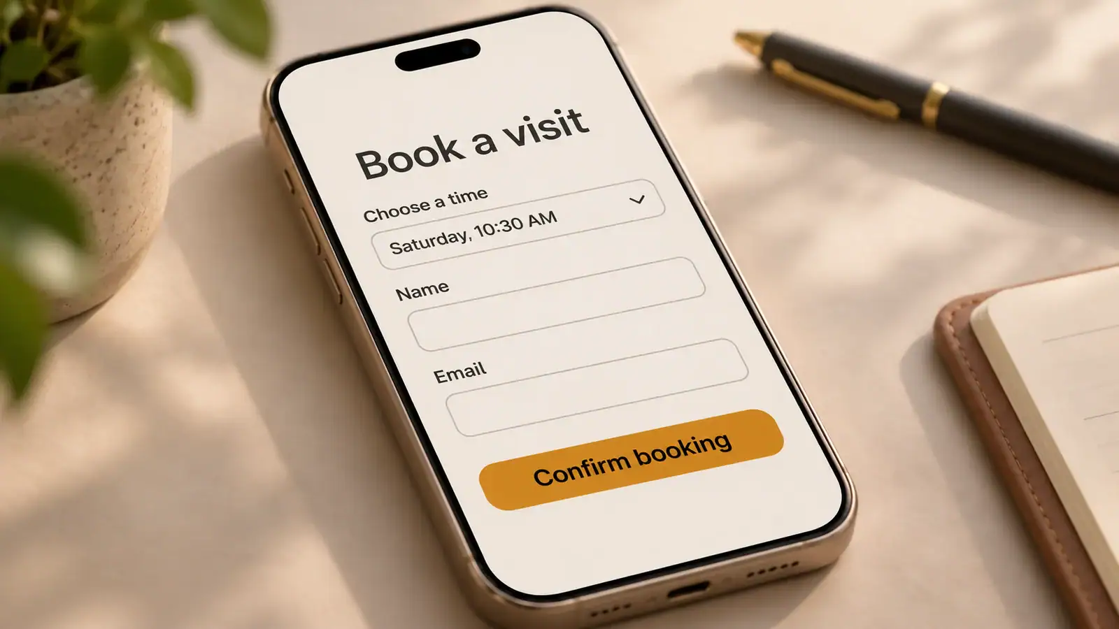
Watch someone use the site before you pay for a redesign
Ask a few people who resemble your customers to try one realistic task on their own phones: “You want to visit the showroom this Saturday. Find out if you can and show me how you’d book.” Let them decide where to tap. Nielsen Norman Group’s guide to usability testing explains why realistic tasks and observation help uncover problems you might miss on your own.

Write down where people hesitate, backtrack, or stop. If several people stall in the same place, start there. A handful of sessions can expose what’s confusing; use your site data to see how often it happens.
Measure the action you actually care about: completed bookings, qualified quote requests, or paid orders per visit to the relevant page. If you have enough traffic, test the change against the original. If you don’t, track the numbers over time and note changes in ads, offers, or seasonality before crediting the design. For a booking site, also look at whether the appointments are a good fit and whether people show up.
Bring us one page and one customer action
If your website gets attention but too few people call, book, or buy, bring us the page you’re most concerned about. Tell us what you want a customer to do there. In a free 15-minute conversation, we’ll walk through that path together and discuss what’s worth fixing first, whether it’s the message, the mobile layout, or the booking process itself.